30초 요약
In March 2025, Matthew Berman reviews creative uses of GPT-4o’s native image generation, including PJ Ace’s trailer remake, infographics, mock interfaces, advertisements and comics. He is enthusiastic about natural-language creation while noting incorrect labels, spelling mistakes and problems producing a requested aspect ratio.
- 1A 102-shot workflowPJ Ace reports nine hours and $250 in Kling credits for his stylized trailer, combining generated stills with animation and editing.
- 2Check the mapA convincing world map contains misspelled and incorrect labels, showing that visual polish is not a guarantee of accuracy.
- 3Tools for more creatorsBerman argues that natural-language image creation gives designers new tools and broadens access to visual production.
- 4An authoritative-looking imageA simulated cat encyclopedia page includes mistakes in its text and anatomy diagram.
- 5Aspect-ratio limitsBerman says repeated attempts failed to create an image wide enough for his intended X header.
핵심 정리
- PJ Ace describes turning 102 trailer screenshots into stylized stills, animating them with Kling and Luma, and re-editing them.
- Generated infographics and maps can look polished while containing spelling, geographic or labeling errors.
- Image generation can transform supplied images into ads, memes, mock interfaces and illustrations.
- A generated interface picture does not demonstrate a functioning application.
- Berman views the tools as useful to designers and accessible to people without traditional editing skills.
- His attempt to create a very wide header illustrates a limitation he encountered in March 2025.
챕터별로 다듬은 전문 읽기
Remaking film trailers
Berman reviews PJ Ace’s process for a stylized Lord of the Rings trailer and another Dune example. The creators combine generated images with video tools and editing.
ChatGPT’s new native image generation has prompted a wave of creative experiments. One example is PJ Ace’s Studio Ghibli-style remake of The Lord of the Rings trailer. I think image and video generation are reaching a point where creators can make ambitious visual work much faster, although the result still takes effort and editing.
PJ Ace says he spent $250 in Kling credits and nine hours re-editing the Fellowship trailer. His process was to screenshot all 102 shots, remix each image into the desired style with OpenAI’s image generation in Sora, animate the stills in Kling and Luma, and edit them back into sync with the trailer. The same approach could be used for an original style rather than an existing property.
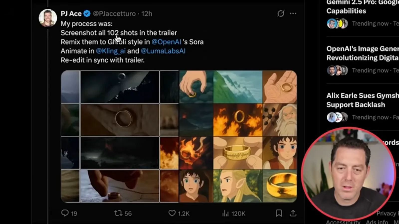
For one shot, the prompt included both the original screenshot and a description of black-cloaked riders fleeing a wave, while requesting similar composition, colors and atmosphere. The generated image translates that scene into an animated style. The creator then described actions such as a fearful man yelling or a concerned woman speaking to animate the shots.
PJ Ace says he did not have time to lip-sync the characters, and split the work between Kling and Luma, switching when one did not work. Berman also shows another creator’s Ghibli-style Dune trailer, which its maker said took 28 minutes from idea to export. These are self-reported examples, not typical production times for every project.
Infographics, realism and the viral trend
Examples include humorous infographics and a world map with mistakes. Berman discusses the early popularity of GPT-4o images and what the tools may mean for designers.
The image model is not limited to animation styles. I show a realistic image of Albert Einstein in a gym and a humorous “How to Live in New York” infographic. The latter combines a clear four-panel layout with legible captions, and the creator places the same infographic in a realistic scene of someone holding it.
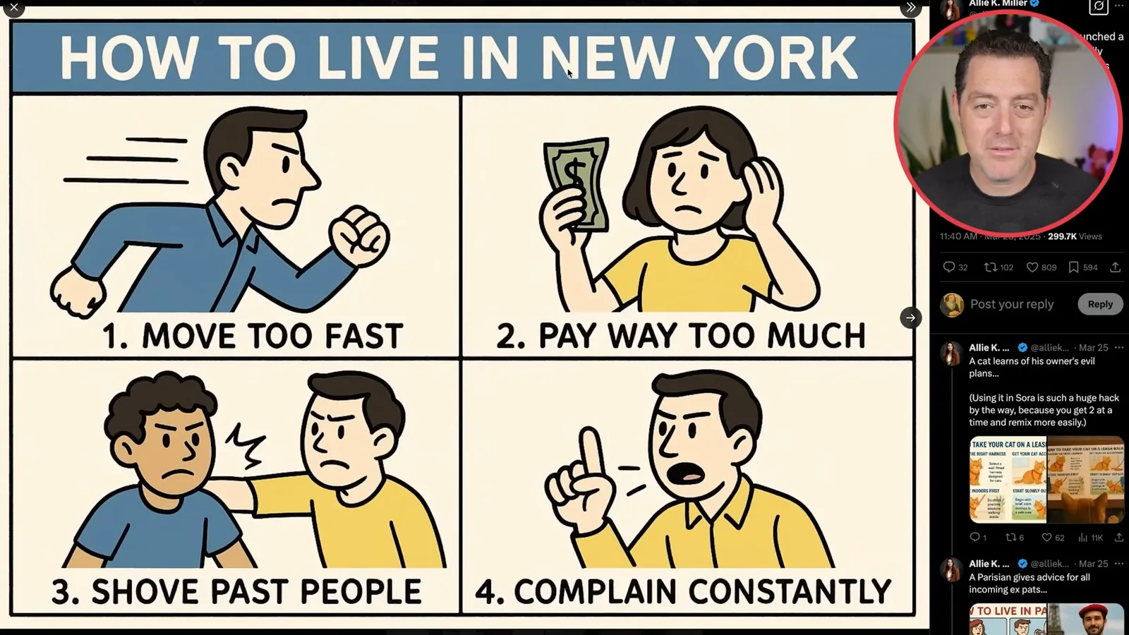
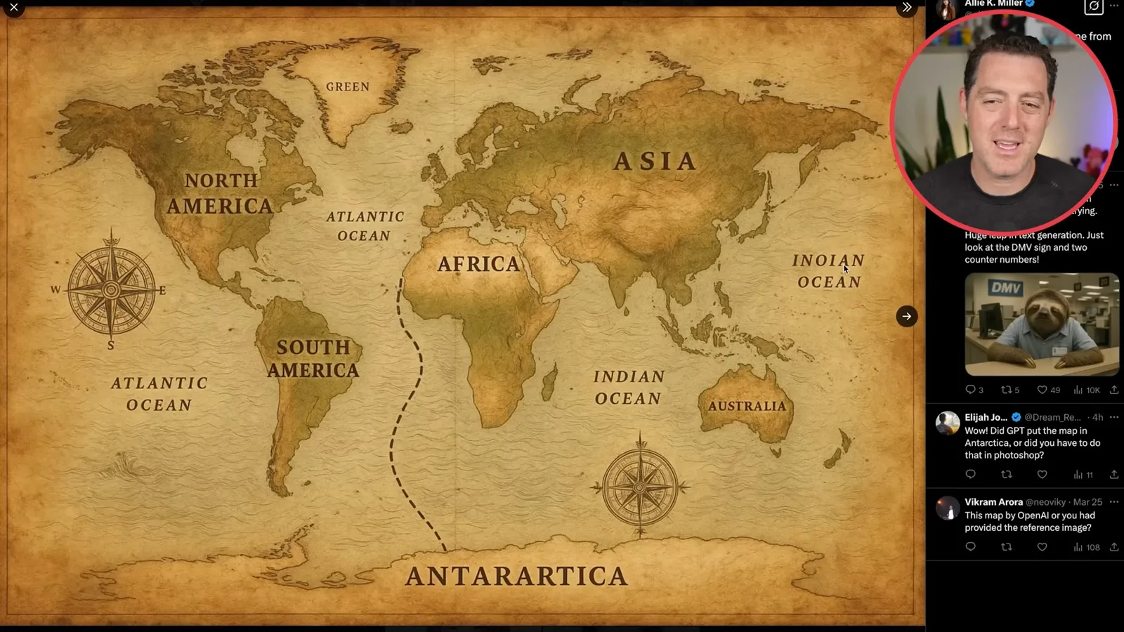
Another infographic explains how to take a cat on a leash walk, then appears in a realistic image of a cat looking at it. A vintage-style world map is visually appealing, but on closer inspection it contains errors: one ocean label is misspelled, Greenland is abbreviated to “green,” and other labels are wrong. A polished image still needs checking.
The examples spread quickly on social media, including a Ghibli-style image shared by Mike Tyson. At the time, Sam Altman said demand for ChatGPT images exceeded expectations and the free-tier rollout would be delayed. Both Altman and I changed our profile pictures in response to the trend; these availability details reflect March 2025.
One commenter suggested that graphic designers were finished. I disagree: designers gain new tools, and people unfamiliar with Photoshop, Illustrator or other production software can also describe what they want in natural language. I compare it to vibe coding and predict that, over the next several years, data and taste will become especially important.
Diagrams, advertisements and interface concepts
Generated encyclopedia pages, anatomy diagrams, ads and mock interfaces demonstrate a range of styles. Berman points out errors that need review.
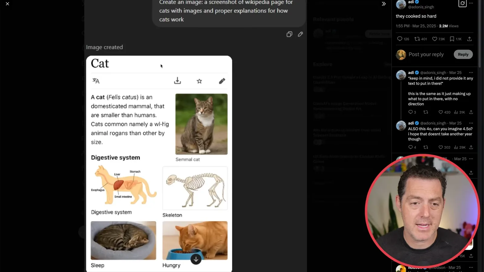
A generated Wikipedia-style page about cats shows both the promise and the problem. It combines text, photos and an anatomical diagram, but some wording and labels are incorrect, including arrows that appear to point to the same organ. It is an image imitating a page, not a reliable reference simply because it looks authoritative.
Shopify CEO Tobi Lütke shared another example: a prompt turned an unfamiliar animal on a T-shirt into a plausible-looking academic anatomy diagram. It looks attractive, but Berman notices misspelled words and questions some labels. A separate example transforms a Ridge wallet photo into a cartoon advertisement.
The model can also extract assets: one example isolates a shark from a MrBeast thumbnail, and I have had reasonable results extracting parts of my own thumbnails. Another example puts Sam Altman’s face into a meme. The output follows the look of the original image surprisingly well.
A product image becomes a Mad Men-style print advertisement for an Obvi collection, with copy and layout matching the requested aesthetic. To me, examples like this suggest uses ranging from business assets to personal projects and memes, though their content and claims still need human review.
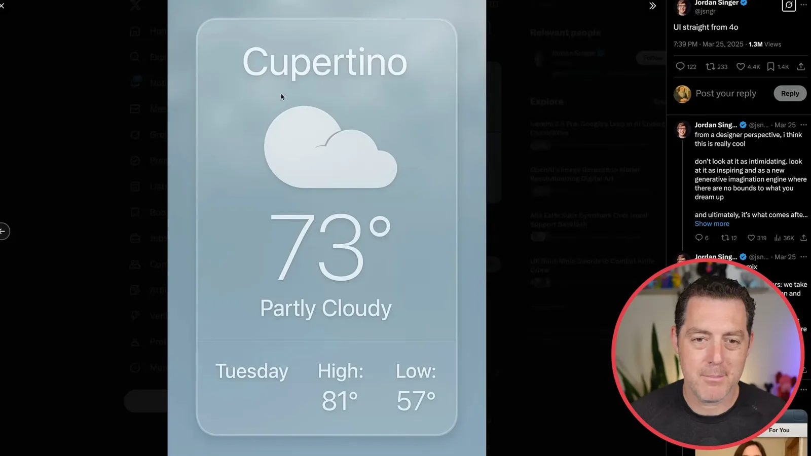
Jordan Singer shows images of interfaces inspired by early iOS and its skeuomorphic design language. One weather screen has a raised card, shading and neatly rendered typography. These are visual designs generated as images; the example does not demonstrate a working app.
Maps, comics and image limitations
Berman shows illustrated maps, an educational comic and transformations of cartoons. He ends with his unsuccessful attempt to generate a sufficiently wide header.
Ashish Singh shares illustrated travel maps of the Philippines and Croatia. The model can combine text and visual concepts in one output, making it possible to request a particular illustration style or even ask for code to be rendered as an image. The appealing appearance does not guarantee geographic or textual accuracy.
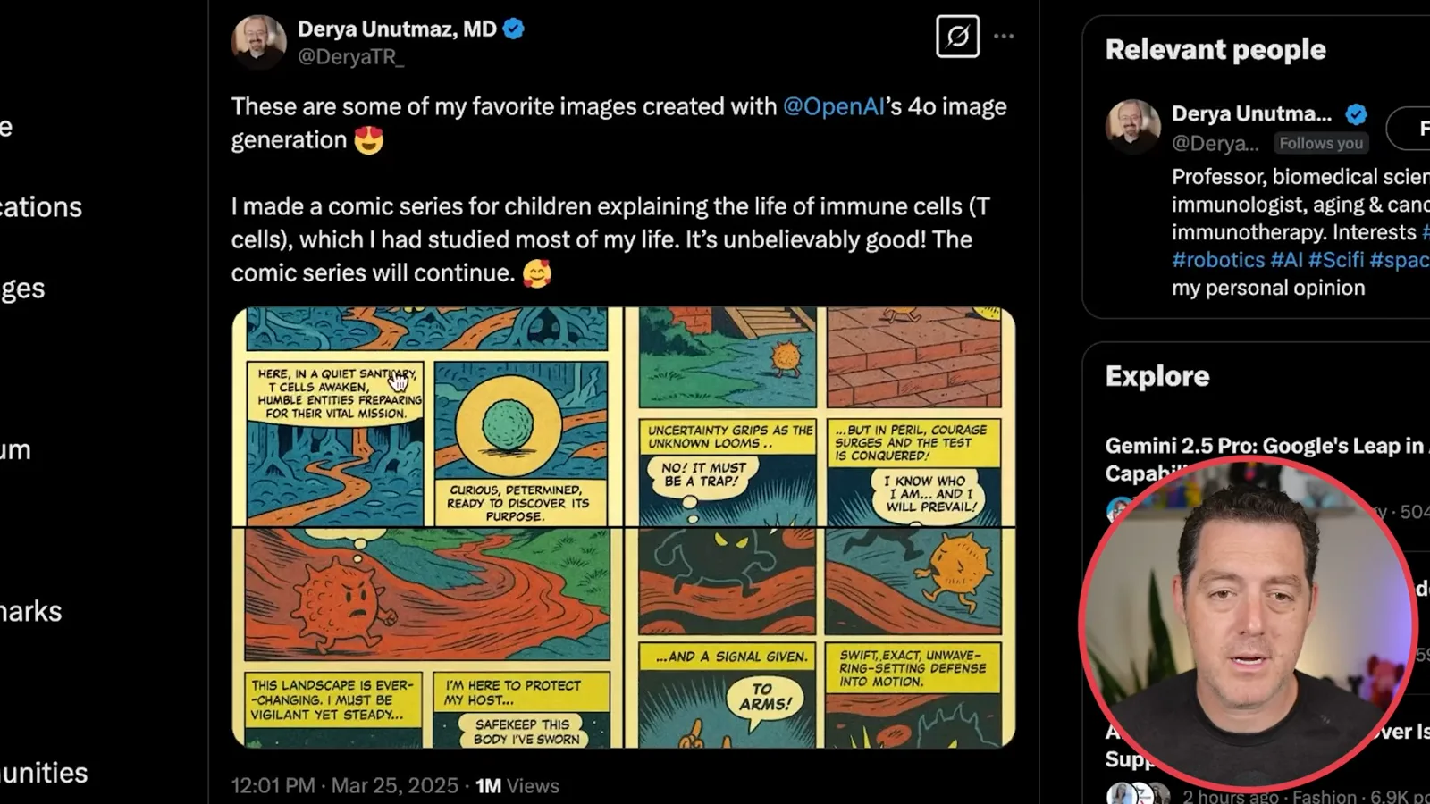
Biomedical scientist Derya Unutmaz shares a comic for children about the life of T cells. Its old-fashioned comic-book look is striking, but the captions contain spelling errors, including in “sanctuary” and “preparing.” Even when image text has improved, it remains necessary to inspect every panel.
Another example turns a Rick and Morty cartoon into a realistic photograph, with an uncanny result, and the All-In podcast hosts appear in a Ghibli-inspired image. These show how a source image can be transformed into a different visual treatment.
There are still limitations. I wanted a wide X header from an image of Rick Rubin, but repeated requests for a more horizontal format failed to produce the dimensions I needed. The second attempt was decent, yet still not wide enough. The examples are impressive, but dimensions and details require checking and iteration.
같은 채널의 다른 글
 34:21EN
 Matthew Berman· 2026년 10월 27일Matthew Berman Examines Anthropic’s IPO Filing, AI Growth and GovernanceMatthew Berman, Sam Altman · Forward FutureThe presenter reviews the S-1’s financial metrics, compute strategy and voting structure while questioning the tension between rapid AI development and safety.
 25:50ENMatthew Berman· 2026년 10월 24일Kimi K3.1 Pro Tested: Strong 3D Demos, Uneven Results and Competitive PricingMatthew Berman · Forward FutureMatthew Berman tests the open-weight model on coding, 3D rendering and visual explanations, then compares benchmark results and prices.
 32:20ENMatthew Berman· 2026년 10월 23일Who Is Local AI For? The Costs, Trade-offs and a Hybrid FutureMatthew Berman · Forward FutureMatthew Berman weighs data control and independence against hardware cost, setup complexity and inference speed.
 1:03:37ENMatthew Berman· 2026년 10월 23일Matthew Berman’s Team Tests Kimi K3.1 on Animation, Games, and ChartsMatthew Berman, Alex, Brian · Forward FutureA live team AMA turns into an informal test of Kimi K3.1, from personal-agent workflows to motion graphics, a browser game, and a benchmark chart.
 0:53ENMatthew Berman· 2026년 10월 22일Sam Altman on AI and the Discovery of New KnowledgeSam Altman · OpenAIAltman expects progress in mathematical discovery to extend to biology, materials and energy.
 0:22ENMatthew Berman· 2026년 10월 21일A Robot Bodyguard Video Shows Dramatic Rescue ScenariosMatthew Berman · Forward FutureMatthew Berman reacts to a short robot demonstration depicting fighting and vehicle-rescue scenarios.