En 30 segundos
Generic AI design often starts with generic input. Nate Parrott, who helped build Claude Design, supplies existing interfaces and visual references, generates many directions, and combines the strongest parts before implementing one. He demonstrates the approach on a product interface, a subway-ridership dashboard and an animated story. His reusable instructions can be checked for concrete faults, but he says people still need to judge whether the result expresses the intended idea.
- 1Many visual options make an unspecified preference visibleParrott asks for different visual treatments, then combines elements from the options he likes. Screenshots, brand material and examples of prior work give the model a more useful starting point.
- 2A product concept can move from a phone note to a canvas of alternativesParrott sends notes about a proposed Claude Duet briefing to Claude Code remotely. The next morning he compares several layouts, edits details and works toward an implementation in the same project context.
- 3Prototype production has shortened, but user feedback still takes timeParrott recalls weeks spent on individual prototypes while building Arc. He says exploration that once took much longer can now happen in a day or two, while learning from real users remains necessary.
- 4AI defaults become generic when the model cannot see their repetitionParrott calls recurring choices such as warm backgrounds and serif type 'Claudisms.' He counters them with the product's actual identity and explicit guidance about patterns to avoid.
- 5A dashboard needs a live connection if its data must updateThe first ridership dashboard uses a snapshot; the demonstration then connects it to Google Sheets. A sources view and the underlying code help readers examine where the figures come from.
- 6Test creative instructions with repeated runs and specific checksParrott compares multiple outputs from the same ordinary feature. He uses concrete checks for faults such as overlaps, while people judge harder questions of taste and intention.
Conclusiones
- Give the model your existing product, brand and visual references before asking it to design.
- Generate several genuinely different directions, then combine and refine the parts that work.
- For an existing app, have the assistant inspect and recreate the relevant interface before proposing changes.
- Connect a dashboard to its source when it needs fresh data, and inspect the data and code behind its figures.
- Test reusable instructions with multiple independent runs and simple checks; inspect subjective visual quality yourself.
Lee el texto editado por capítulos
Start with references and compare directions
Parrott gives Claude examples of the intended visual world before asking it to design. Multiple variations let him pick and combine elements before committing to a complete result.
The quality of an AI design depends on the material it starts with, says Nate Parrott, who helped build Claude Design. Give the model visual references, examples of your own work and a sense of the brand instead of asking it to invent a polished interface from a bare description.
A mood board or screenshots of products with the desired feeling provide concrete direction. If a team already has a visual identity, its existing work is useful context. Parrott says the model can look at those references and develop something informed by them rather than falling back on its defaults.
Parrott likes to start by asking for many directions: variations in type, color and overall feel. Comparing those options exposes choices that are hard to specify in advance. He can point to a combination he likes and ask for another round built from those elements.
For an existing product, Parrott asks Claude to look at the actual code and recreate the current interface before proposing alternatives. That gives the design work a shared starting point and makes it easier to carry a chosen direction back into the product.
If layout is the hard part, he suggests exploring the structure first, before committing to colors and typography. Familiar interfaces can also be useful references for how information is arranged. The point is to make the decision that matters most early, then refine the rest.
He uses the same approach for presentations: try different visual treatments before asking for an entire deck. Agreeing on a direction early avoids generating every slide in a style that later has to be replaced.
Turn a briefing idea into interface options
A note written on a subway becomes a set of proposed Claude Duet interfaces. Parrott compares layouts, edits them and uses the project context to move toward implementation.
Parrott demonstrates an early concept for Claude Duet, a personal assistant intended to be proactive. The particular design he shows was not built. It explores how to present suggestions so a person can find something useful among many possible tasks.
He first wrote ideas in Notes while riding the subway, then sent them to Claude Code remotely and asked it to examine the code and make alternatives. By the next morning he had a canvas of versions to compare, rather than a single finished proposal.
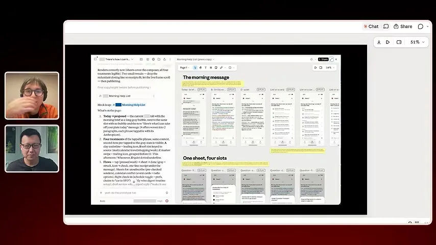
The versions explore how dense the briefing should be and how suggestions might sit alongside one another. Parrott compares the layouts, asks for adjustments to details such as spacing and icons, and continues from the options that work. Keeping the alternatives visible helps him see what changed.
Claude Design lets him edit parts of the canvas directly or describe changes in conversation. Because the conversation contains the designs and their underlying code, he can also ask Claude to implement a direction in the application. On a phone he can review and comment on the work, although the direct-editing controls are not the same.
The canvas preserves the earlier attempts as the work develops. Parrott can move between different directions, combine pieces and use the history to explain a decision, instead of losing every rejected version as the implementation changes.
Faster prototypes and the origins of Claude Design
Working prototypes can reach users much faster, although interpreting feedback still takes time. Claude Design began as a separate internal experiment before moving into the main product.
The speed of producing a prototype changes when he can get feedback. Parrott says he can put a working idea in colleagues' hands and learn from how they use it, rather than spending most of the effort preparing a static proposal.
He contrasts that with building Arc at The Browser Company: before AI tools, he recalls spending weeks on individual prototypes and about a year in preproduction. Now he says similar exploration can take a day or two. Observing users and deciding what their reactions mean still take time.
Claude Design began as an internal, separate project. Parrott wanted room to change the entire experience, including the interface and the way the model was used, while experimenting with ideas such as multiple people collaborating in the same chat.
Keeping the first version separate let the team learn quickly, but it also meant users wanted capabilities already available elsewhere in Claude, including mobile access and connections to other tools. Once the approach was more settled, the team brought it into the main product.
The maker of a product is unusually willing to answer many detailed questions about it, Parrott says. He can spend time explaining the intent and correcting the design because the result is something he wants to use himself. That context changes what the assistant can produce.
When he wants a change in an existing codebase, he can ask the assistant to inspect and reproduce the relevant part before exploring. That reduces the gap between an attractive mockup and the actual interface the team must change.
Why AI designs repeat the same visual habits
Parrott calls common defaults 'Claudisms' and uses brand context and explicit direction to resist them. Motion output also needs judgment and iteration.
Parrott describes the recurring look of AI-generated interfaces as 'Claudisms': the model, starting fresh, may reach for a familiar combination of serif type, warm backgrounds and orange accents, or repeated cards and sidebars. It can treat the choice as distinctive without seeing how often others have received the same answer.
His practical response is to supply the real brand and say which habitual patterns to avoid. He does not suggest that a particular font or color is always wrong; the problem is using it automatically when it has no relationship to the product. More reliable ways to make models choose original directions remain an open question for him.
Asked about animation, Parrott says early results were funny because they were so bad. More recent output is often merely okay and still needs several rounds of direction. A model can assemble moving elements, but that does not mean the resulting sequence has good timing or a clear story.
Build a dashboard and connect its data
A New York subway ridership example moves from a CSV to a dashboard. The demonstration connects the display to Google Sheets and shows where to inspect sources and code.
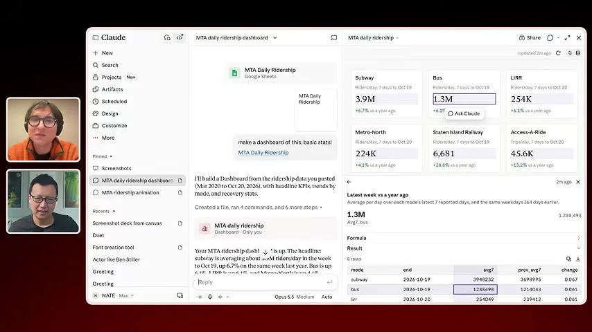
Peter Yang and Parrott turn to a dashboard based on New York City subway ridership data. The example starts with a CSV file placed in Google Sheets; Claude builds a visual display from the figures, allowing them to inspect the data in a more accessible form.
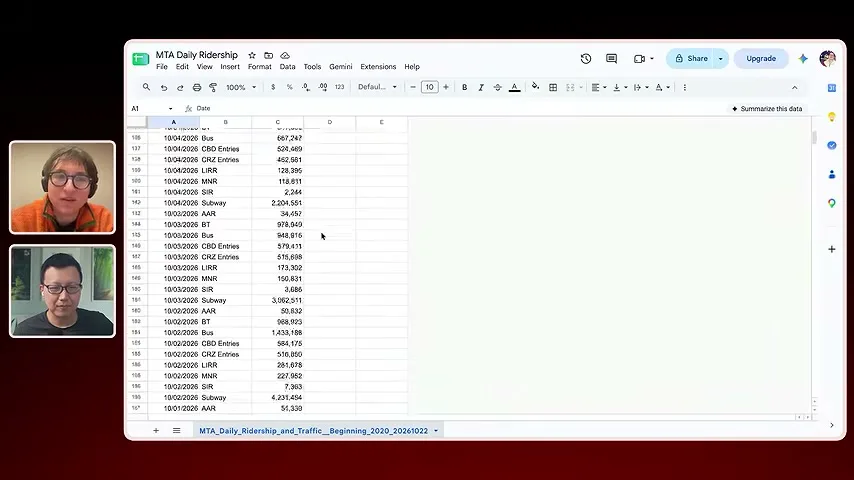
The initial dashboard is a snapshot. When Yang asks for it to stay connected to the sheet, Parrott shows how a connection through the Model Context Protocol, or MCP, can give the dashboard access to the source rather than relying only on a one-time copy.
The dashboard includes a sources view that lets a reader trace numbers back toward their data and the code used to produce them. Parrott shows that the underlying implementation can be inspected and modified, including how it fetches the information.
Give a data story time to play out
The speakers explore several storyboards for an animated version of the ridership data. Parrott refines the visual motif, pacing and focus through specific comments.
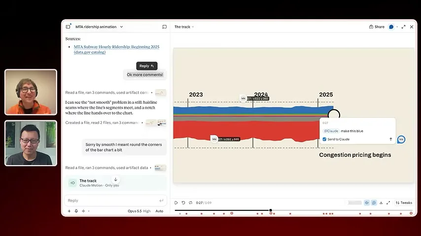
Yang asks for an animated presentation of the same ridership story. Parrott starts by asking Claude for a storyboard and several visual approaches. One direction uses the subway map's lines; others draw on transit imagery such as a MetroCard or countdown display.
Rather than accept the first movie, he compares the directions and chooses elements to continue with. He wants the visual language to carry across scenes so the piece feels like a coherent story, not a sequence of unrelated templates.
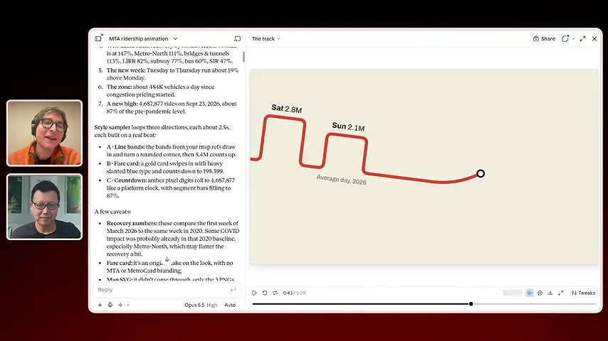
The first attempt moves too much information at once. Parrott explains that viewers need time to read and that the presentation should direct attention from one idea to the next. He asks for changes to pacing and for a line motif that can connect the scenes.
The tool supports comments at a specific time and place in the piece. That makes it possible to point to the exact element that feels wrong and describe a correction in context, instead of trying to identify it in a long general prompt.
Test reusable creative instructions
Parrott builds reusable skills from examples and runs repeated tests to see whether revisions help. Concrete checks can catch some faults, while subjective quality still requires human review.
Parrott also experiments with reusable skills: instructions and examples that teach Claude a repeatable way to do a task. One skill for internal sizzle reels comes from studying corporate videos and identifying patterns the model can use when making a new one.
To see whether an edit to the skill actually helps, he runs the same deliberately ordinary feature through it multiple times and looks at the results. Comparing independent attempts can reveal whether the revised instructions consistently improve the work or merely produced one lucky example.
He prefers clear yes-or-no checks to an unexplained one-to-five quality score. Some defects, such as overlapping elements or inconsistent fonts and colors, can be expressed as concrete checks. The broader question of whether a design has taste is harder for a model to grade reliably, so people still inspect the output.
Yang asks what taste means when a model can imitate examples. Parrott treats it as more than following a catalog of attractive choices: the maker needs a point of view about what fits the work and an ability to notice when a result does not express the intended idea.
Taste, project context and making tools
The conversation turns to creative judgment, keeping a project's work together and using coding agents. Parrott reflects on Arc and the changing speed of prototyping.
They discuss the appeal of work that feels authentic and the difficulty of predicting which aesthetic decisions will matter. Models can generate many candidates; deciding which one communicates something remains part of the creative work they describe.
For his own workflow, Parrott often keeps a project in one long conversation, with many artifacts and experiments available in context. He gives an example containing dozens of artifacts, so the assistant can refer back to earlier attempts and the reasoning behind them.
He also uses Claude Code with the relevant repository and delegates some work to subagents. In his mental model these are ways of working with the same assistant on a project, while the actual context available in a given place still matters.
Yang asks how Parrott feels about Arc being deprecated. Parrott is proud of the work and says he is happy to see more browser innovation. He does not claim The Browser Company deserves credit for every change, but notes that Claude sometimes recognizes an 'Arc-style sidebar.'
Yang jokes that Claude sometimes says a task will take days and then completes it in minutes. Parrott has seen the same mismatch: the model may describe weeks of work, although he expects to do it together in far less time.
Parrott says he does not know why the model makes those estimates. He points readers to his website and social account for his work.
Más de este canal
 25:17EN
 Peter Yang· 11 nov 2026PódcastPeter Yang splits Claude Code work between Opus and FableHe uses Opus for routine execution and reserves Fable for harder decisions, code audits and family-care coordination.
 21:47ENPeter Yang· 9 nov 2026PódcastFable 5.2 won four creative tests; Opus resisted pressure betterPeter Yang compared five tasks and found Fable stronger at creative outputs, while Opus more often challenged misleading pushback.
 46:40ENPeter Yang· 8 nov 2026Pódcast · 2 vocesAshley Alexander: How AI Helps Me Care for My Parents With CancerInvitado: Ashley Alexander · Presenta: Peter YangA caregiver uses AI to prepare for appointments, organize records and ask better questions—while keeping doctors at the center of treatment.
 17:50ENPeter Yang· 4 nov 2026PódcastPeter Yang’s Five Steps for Using AI to Help Care for His MotherYang uses a shared care brief and organized records to navigate appointments, while making time for family.
 15:03ENPeter Yang· 3 nov 2026PódcastHow Peter Yang Used an AI Phone Agent to Negotiate His Internet BillAn AI call negotiated a lower price and faster service, but Yang still had to approve the change himself.
 33:09ENPeter Yang· 1 nov 2026Pódcast · 2 vocesJaclyn Konzelmann: When AI Can Build More, Choose What Deserves to ExistInvitado: Jaclyn Konzelmann · Presenta: Peter YangGoogle Labs pairs short strategy documents with prototypes, user co-creation and lessons from experiments that end.